Color My Home Beautiful- How to Pick a Scheme
 Choosing color palettes can strike fear in the hearts of even the most confident homeowner. Many people struggle to decide which color scheme will best complement the inside of their homes. They don’t trust their ability to match complementary shades. Others fear they may quickly tire of the color palette they choose. And those are the lucky ones, who at least have an idea of where to start. You can avoid the nerves and the second-guessing by considering a few simple color guidelines.
Know What Colors You Like
Before heading to the local home improvement store, survey the colors in your life that you’re drawn to.
Open your closet: What color dominates your clothing? What shade is your favorite sweater or shirt? What shirt or dress catches your eye when you open the door?
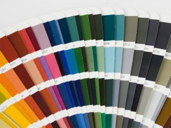
Flip through the magazine rack: What colors catch your eye? Rip out the pages that appeal to you, even if it’s the background wall of an ad. Consider visiting a local bookstore to purchase some design periodicals.
Group the images: Maybe you have a lot of warm colors, such as reds and yellows. Perhaps you have picked a more neutral palette. You should start to see some patterns as to what colors appeal to you the most.
Think about the room you want to paint: What color is the floor and ceiling currently? If you don’t plan on changing the rug or carpeting, you will want your new color palette to work with what you already have. This also holds true for your furniture.
Another aspect of your room to consider is the rooms that adjoin it. If you aren’t planning on repainting those rooms, you will want to select a color scheme that coordinates with their wall colors. Thinking back to your color file, pick one or two color schemes from it that will work with your room. These do not have to exactly match any existing colors. It will be a more interesting backdrop for your room if it coordinates instead.
Take Your Time
When you think you have a color palette chosen, hit the paint counter and grab some swatches in shades that are darker and lighter than you think you want—even pick some that have slightly different tints. For instance, if you were thinking of painting your kitchen green, try some swatches with a bit more blue or a bit more yellow.
View the swatches in the room you are planning on painting. Try to look at them at different times of day. You may be surprised to see how different the color looks in your home than in the store. Your home’s lighting and the way it changes throughout the day also may alter your opinion.
After you’ve picked a swatch or two, buy enough paint for a sample. Paint a section at least two feet by two feet and let it dry. Not only can paint dry darker than it is depicted on a sample card, but the tint may be slightly different as well.
Mood and Atmosphere
Paint can help fix a room’s shortcoming. If you want a low ceiling to seem higher, paint it a lighter color. Conversely, you can make a ceiling seem lower by painting it darker than the walls.
Here are some other painting tricks to consider:
- Make a large room appear smaller by painting the walls with warmer or darker hues.
- Give a small room a spacious, airy feeling with light colors on the walls, floors and ceiling.
- Create a focal point by painting one wall a darker shade than the rest of the room—or even a complementary hue.
- If you want a more lively color palette, pair several tones together. Most decorators recommend using three values of one shade of color in a room: light, medium and dark.
- Use an upholstery pattern you like to select your paint scheme and match your shades(s) to it.
-From Better Homes and Gardens