Halls of Shame:Top 10 Design Blunders
 Each decade has had its share of questionable home design, from the extensive wood paneling and Harvest Gold appliances of the 1970s to the next decade’s overuse of glass blocks, vertical blinds and country-style decor. Some of these serve as powerful buyer-repellant; others just ding the price, as people figure in the cost of covering up, ripping out or otherwise correcting these 10 home fashion faux pas.
Shag Carpeting
This deep-pile carpeting, named for its shaggy texture, was popular in the 1970s in a bright array of colors, including “Apache Flame” and “Arroyo Gold.” Sure, it was kid-friendly, but it trapped dirt and got matted easily, requiring the regular use of a shag rake to keep it from looking like a dog with mange. While shag area rugs are now making a minor comeback with hipsters, most buyers recoil at the old wall-to-wall stuff.
Popcorn Ceilings
This ceiling treatment was popular between the 1950s and the 1980s and was designed to reduce noise and hide imperfections. But this spray-on stucco has become the pariah of interior finishes, spawning a “cottage cheese” removal industry. Agents and designers alike say they have seen far too much of this messy stuff. What’s worse is that the earliest versions of this finish often contained asbestos fibers, so homeowners should get it tested before they try to scrape it off.
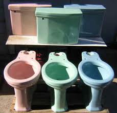
Colorful Sinks and Toilets
When designers say add a pop of color, commodes are not where they want you to add it. We have seen toilets in blue, green and pink. Tubs are easier to hide from sellers, behind a shower curtain.But the toilet and sink are front and center. It brings down the price Purchasers are going to offer, because they know they are going to have to fix it.
Metallic Wallpaper
Wallpaper of any sort can be problematic, mainly because of the difficulty of removing it if it doesn’t appeal to a homebuyer’s sensibilities. The worst offender has to be metallic wallpaper — from those silvery floral dining room prints to bronzy metallic stripes in the powder room. Worst of all, this flashy trend wasn’t limited to the 1970s. If there was a runner-up in the bad wallpaper category, it would have to be those floral wallpaper borders that were so ubiquitous in the 1980s. If your home has large flowers, fruit, stripes, etc., on the walls, remove the wallpaper and paint before you put your house on the market.
Carpeted Bathrooms
Whose bright idea was it to put material on the floor that can get mildewed and matted? A lot of people, apparently, because designers say they still see it frequently, and some clients still ask for it. It retains water and is a big repository for bacteria. Those that don’t want cold feet in the morning are not consigned to fuzzy bath mats, however. Invest in radiant heat flooring or put down a wool flat weave area rug that can be removed easily for cleaning.
Wood Paneling
Big in the 1970s, this homey treatment is best left to vacation cabins. Installed on walls to convey a warm feeling — often paired with the aforementioned shag carpeting — buyers these days consider it dark and hard to deal with.
Hollywood- Style Bath Lighting
These inexpensive long bars with big light bulbs were supposed to convey the glamour of a film star’s dressing room. But in most cases, they just give off too much light. A lot of these light bars went into new homes during the 1970s and 1980s, she says, because they were the least expensive option for builders, not because they were the best design choice. In many cases, they illuminated other bad bath glamour finishes of the time, such as cultured marble countertops with blue, black or brown swirls.
Faux Finishes
During the 1980s, many weekend do-it-yourselfers tackled some form of faux finish, from marble to granite to crumbling limestone. Everyone, it seemed, wanted to pick up a sponge to give his or her home that Tuscan villa look. The problem is that no one did it very well, designers say. Some of the worst example are on interior columns or older cabinets.
Sliding Plastic Tub/Shower Enclosures
One bad feature that has spanned decades is the tub-shower combo with a plastic door. Old plastic shower doors are festooned with soap scum and out-of-date gold trim. A simple shower rod and curtain is much easier to keep clean, as are glass doors that open, rather than slide on tracks. The doors with sliders often come off the tracks, and the tracks provide a recessed hard-to-clean surface that’s a magnet for mildew and grime.
Mirrors Everywhere
Yes, mirrors do make a room look larger. But when glued across large expanses, they’re downright tacky. Rip down mirrored closet doors, backsplashes, etc. before going on the market. This is not a knock on all mirrors. A large framed mirror over a fireplace or hung in a foyer to bounce light can be nice. The difference is, you’re talking about one hung mirror versus a permanent mirror wall.
Sorry we are experiencing system issues. Please try again.

Comments are closed.